With Generation 2 building on the surprise smash success of the first Generation of Pokemon the franchise was secure in its position. Pokemon was a monster hit and they had been able to keep the magic going. The Anime was still on air, they had been able to release a few more films, many theatrically, even in overseas territories and Gold and Silver had improved on the original games and were widely hailed as some of the best RPG’s available. They had even been able to get character designs like Lugia and Togepi to make an impact in public consciousness almost as big as the original 151.
Gen 3 then didn’t have the pressure the designers were under for Gen 2 and you can see this in the designs. There is a lot more experimentation going on, a shift away from copying what was successful before and instead trying to come up with new ideas, animals that hadn’t been adapted before, and even looking to adapting metaphysical concepts instead of just animals and physical objects.
One thing you’ll notice straight away is that the art style is dramatically different. The original 151 are very flat cartoony designs. They have a simplicity to them that makes it easy for a kid to draw them and works well on the limited graphic capabilities of the Gameboy and Gameboy Color. Starting in Generation 3 we get much more sophisticated artwork, there are more textures, more realistically proportioned monster designs and more detail. There’s also a lot more depth to the colours, instead of being flat colours the designs incorporate more shading and shadow effects, highlights and the like. It s a quantum leap in terms of art and shows real improvement from Ken Sugimori as an artist. However, from a design perspective its probably a step back. Adding complexity detracts from the simple and iconic power of the original 151 designs.
Treecko, Groyvyle and Sceptile


Fittingly these three designs point out a lot of the strengths and weaknesses of Generation 3 straight away.
In the strengths department the first thing to note is the originality. Bulbasaur and Chikorita are very similar designs, a smallish reptilian monster with a bulb on its back or leaf on its head. Treecko obviously follows some of this but the leaf is incorporated more subtly, it replaces a body part (the tail) rather than just being slapped on. It’s also a bipedal monster whereas Bulbasaur and Chikorita are both four legged. Finally rather than being some kind of generic reptile this is specifically a gecko, an animal the series has not adapted before.
The new art style is also in clear evidence, just look at Treeko. There is shading under his mouth and on his limbs and highlights at his stomach, eye tips and on his tail. This is much more of a drawing and less of a video game sprite. The new art style especially works well on Groyvyle. That thing looks badass, a velociraptor leaping out of the trees with clawed feet and hands. The leaf blades add a real sense of movement and help sell the idea of leaping death. This is that rarest of things, a bad ass pokemon design, not cute, not goofy, not ugly but sleek and deadly and dangerous.
On the bad side though we have unnecessary clutter and complications. Why does Sceptile have that little line and downward pointing arrow on his chest? What does it add? It doesn’t suggest movement, it doesn’t define shape, its not symbolic of anything its just unnecessary clutter. Also what are those little balls on Sceptile’s back? I never worked that out. Are they fruit? Seeds? Pollen?
Torchic, Combusken and Blaziken


Again some points for originality here. Unlike the previous two fire types this monster is not actually on fire instead the fire is subtly suggested in the flame designs on the feathers and the colouring. Its very distinct from the last two fire starters and that’s a good thing.
In fact both Combusken and Blaziken look much more like fighting types with their dramatic action poses, sharp claws and kicking legs.
I also love it when animals that you’d normally barbeque gain fire powers. The delicious irony. Delicious, like barbecued chicken.
Hmmmmmm, chicken.
Torchic I like, its simple and cute and Combusken is about as good an exeuction of kung-fu-fire-chicken as you could ask for. Blaziken though; well for starters it looks nothing at all like a chicken, it just looks like a feathery anthro monster. It also has tons of weird bizarre feature, like its flares, its feather waist coat and the frankly unsettling feathering round its groinal regions,
Mudkip, Marshtomp and Swampert


For reasons that aren’t entirely clear to me the internet loves Mudkip. Images of Mudkip saying “moar” have attained almost lolcat levels of meme penetration and I have absolutely no idea why.
I kind of love these three. First of all I love the fact that they decided to make a monster out of a mudskipper in the first place. Mudskippers are awesome of course, they’re fish that can live outside of water for short periods and even climb trees. That’s such a mind boggling concept that of course somebody should make a pokemon out of it eventually. Its just, well, look at a mudskipper.

That guy is many things but cute is not one of them. The effort needed to take that, turn it into something as cute as Mudkip ad yet still keep them as recognizably the same animal is to be applauded.
I don’t really have much to say about Swampert and Marshtomp except that Swampert looks unbelievably goofy. There’s something about his vacant eyes and open mouth that just says “duuuuuuh.”
Poochyena and Mightyena


These designs are so dull I almost forgot to write something about them.
Did you know female Hyena have a clitoris larger than the Males’ penis and that it can actually become erect?
That was an interesting fact. These two are not interesting Pokemon.
Zizgzagzoon and Linoone


This generations Rattata and Ratticate and once again a massive improvement. For starters neither animal is unaccountably purple and that is always a good thing. Secondly Zigzagzoon is kind of visibly interesting with the nice zig zagged stripe pattern. They’re squarely in the dull but complicated bracket though, a massive step down from Sentret in the last generation.
Wurmple, Silccon, Cascoon, Beautifly and Dustox

Wurmple is the first example this generation of the “stick a horn on it” crew. Representing for lazy design. Word brother. But if you think that’s lazy wait until you get a look at…
Silcoon and Cascoon


Mirror flipped designs of a ball with spikes. And an eye. Silcoon is a terrible and boring design anyway. Pokemon has done cocoons before with Metapod and Kakuna but they had faces and expressions. These are, literally, spiky balls. And the sheer massive balls it takes to submit what is effectively the same design twice is just mind blowing. The “I do not give a fuckery” on display here is nigh on cosmic.


Hey Beautifly, Butterfree called and he wants his shtick back.
You might think I’d be similarly harsh on Dustox but that guy at least has the decency not to look exactly like Venomoth, in fact the design is fairly original if a little dull. I do love his weird eyes though, I don’t know what the thinking behind them is but they’re creepy.
Lotad, Lombre and Ludicolo


Although Lotad is basically a frog with a lilly pad stuck in its back I actually don’t mind the “lets just stick a plant on an animal” design school here, mainly because this links in with notions of camouflage. Frogs sit on lilly pads so what if we have a frog underneath one? And while it swims along all the other Pokemon would see would be a lilly pad! It’s a nice idea, it actually sounds like something you’d get in nature and this is a dull but adequate execution of that idea.
Then with Lombre the crazy starts because the obvious evolution from camo’d frog is Mexican cowboy right? Because that’s what they’re going for. They evolved the frog into some kind of anthro monster and made his lillypad into a sombrero.
Whilst I don’t really get the thought process that links lillypad’s to mexican hats I quite like Lombre, its a subtle execution of the high concept with the cowboy stuff primarily limited to that hat, name (a play on Hombre, a kind of spanish slang for a guy) and the pose and facial expressions. There are also some other fun details like how the colouring suggests a waistcoat.
Then the crazy goes full on with Ludicolo. First of all it goes from an anthro frog to some kind of duck which…..whatever fine lets just run with it but everything else. Just drink in the ridiculous glory. First of all the logical evolution from Mexican cowboy is to Mariachi band which…yes, of course it is. And whilst Lombre was fairly subtle Ludicolo and subtle should never be two words used in the same sentence. It’s wearing a poncho for god’s sake, it looks like a maraca, it has a sombrero that is also a palm tree. A sombero that is also a palm tree!!! This thing is amazing!
Seedot, Nuzleaf, Shiftry


Like the previous trio we get a completely average pokemon design, a fairly well executed anthro monster and then something batshit crazy. And again its glorious.
Seedot is an acorn with legs and eyes. Pokemon designs don’t get more classic than that, it’s dull but its fine and admittedly they hadn’t done an acorn before.
Nuzleaf looks like some kind of Amazonian warrior and is basically a boring anthro monster with poorly executed plant bits like having a leaf on its head. I think he might be the first pokemon with visible nipples so he has got that going for him at least.
And then for some reason to the Japanese the logical extension from Amazonian warrior is Kabuki actor.
For those of your unfamiliar with Kabuki here is wikipedia’s entry on it. Briefly it’s a very stylised dramatic form that mixes dance and a weird kind of poetic singing to tell stories. All we need to know for our purposes is that Kabuki actors look like this

Shiftry is basically just a boring anthro monster with poorly incorporated plant elements but the very fact that they wanted to make a pokemon out of something as aesthetically bizarre as kabuki redeems it. Kabuki looks odd and interesting so Shiftry looks odd and interesting. And his feet are sandals, I just love that little touch.
Tailow and Swellow


This generations Spearow and Fearow aka boring birds I have nothing funny or interesting to say about.
Wingull and Pellipper


Seagulls, an animal famed for stealing and eating food from out of human hands, evolve into Pelicans, an animal famed for having a massive beak that can stretch and extend thus presumably allowing it to to steal more food from human hands.
That there is a bit of observational genius, well done.
Ralts, Kirlia and Gardevoir


I initially had no idea what on earth is supposed to be going on with these monsters other than being boring anthro beasts with stubby arms. According to pokemondb.net ralts’ name is supposed to be a reference to the waltz so I guess they’re all dancers? I can see Kirlia as a ballet dancer and I guess Gardevoir is wearing a ballgown but how does that relate to Ralts at all?
As much as I dig on Chansy for being many fetishes personnified there is a disturbing amount of Gardevoir porn out there on the web. Some people want to shag pokemon it seems and naturally they gravitate towards the one that most looks like a sexy lady, even if she has no mouth and technically no legs.
Whatever, it takes all kinds to make a world. Even people who want to shag dancing psychic monsters without legs.
Surskit and Maskerain


What on earth has Surskit done that he’s so embarassed about? I mean look at the blush on his face, he’s deeply ashamed, I only wish I knew what it was he’d done.
Shroomish and Breloom


Shroomish is one of my all time faves and it is solely because of the hilarious frowny face. Most Pokemon are drawn with fairly neutral facial expressions or a happy smile or a bad ass scowl. Shroomish might have been trying for bad ass scowl but what they got was grumpy old guy chasing kids off his lawn. Such a shame he doesn’t have a fist to shake impotently.
Breloom however does have fists and is a fighting type, with all manner of punching moves he can use. Yet those arms have clearly got as much reach a T-Rex. Also I don’t know what thought process goes from “walking mushroom” to “t-rex in a samurai hat” but I think the clue might be in “mushroom.”
Slakoth, Vigoroth and Slaking.


An apt metaphor for the aging process. In youth we are unwise and easily confused, grasping for answers. As adolescents we become convinced we know all and lash out at the world hoping to change it. As we mature we accept that the world is the way it is and relax becoming comfortable with ourselves and our lot in life. Also we get fat and gain man boobs and lose a lot of hair.
Nincada, Ninjask and Shedinja


This trio is all about Shedinja who has to be one of the most inspired designs in any of the Pokemon games and one of my all time favourites.
Nincada and Ninjask are of course Cicadas. For those who don’t know Cicadas are insects that the Japanese have a particularly attachment to since they signify that Summer is here. This is because Cicadas have a very strict life cycle. Every summer the larval form, the Nincada equivalent climbs a tree and forms a cocoon. It then bursts from that cocoon and spends the next couple of weeks repeatedly banging its body against trees and screaming causing a resonating chamber in its own body to make one of the loudest and most irritating sounds ever found in nature. The first year I lived in Japan I didn’t have Air Conditioning so to escape the oppressive heat I had to sleep with my windows open. This then gave me the new problem of having to sleep though the noise Cicadas make. The thing it is most similar to would be someone starting a pull cord engine like on a lawnmower or on a chainsaw, that big loud wind up noise followed by several juddering noises afterwards. A kind of krrrreeeeeeeettttt, reet, reet, reet, reeeeeeeeet, only louder, in every tree, all day and night and with an element of screaming.
Whether by stockholm syndrome or some other madness though I actually grew to like the Cicada noise and began associating it with fond memories of Summer eating watermelon, drinking in beer gardens and watching fireworks.
None of that is pertinent to these designs except that Cicadas leave a larval cocoon on the tree they climb up and that is a Shedinja. The first two designs are basically cartoony versions of a larval and full grown cicada but Shedinja is a Pokemon design based on the husk a Cicada leaves behind. Rather awesomely you can’t catch a Shedinja, when you evolve a Nincada into a Ninjask a Shedinja just magically appears in a Pokeball on your team having been left behind when the Nincada turned into the Ninjask.
And its a ghost/ bug type suggesting that the left behind remains become animated by some lonely spirit.
I find that high concept to be just awesome, a shed husk flying around seeking revenge for being discarded by its former occupant, a dead thing that still moves and fights and all tied in with natural cycles.
And as if that high concept wasn’t cool enough the pokedex entry improves it.
“SHEDINJA’s hard body doesn’t move – not even a twitch. In fact, its body appears to be merely a hollow shell. It is believed that this POKéMON will steal the spirit of anyone peering into its hollow body from its back.”
Notice anything problematic about that?
How about that when you’re playing the game you’re constantly looking at Shedinja’s back.
Yup, anyone wanting to use a Shedinja risks having their immortal soul sucked from their body. That’s a risk that only the most hardcore Pokemon trainers are prepared to make.
Design wise Nincada and Ninjask are just competent cartoony versions of the animals they’re named for but Shedinja again goes a step above. My favourite design element by far are the wings formed from the part of the shell that burst open when Ninjask emerged. Not only is that a nice extrapolation from the concept of it being a discarded husk but it sells the idea that Shedinja “never moves” by giving it rigid pseudo-wings. I also like the halo which is just odd and the kind of off the wall design feature Gen 3 largely got rid of.
Whismur, Loudred and Exploud


These three would be an example of one of my favourite sub-groups of pokemon designs, namely gimmick pokemon whose design reflects their gimmick. For this family its all about noise and every design choice reflects this.
Whismur is obviously based on a rabbit with its big ears and those ears suggest noise but not in the way the other two monsters do. They suggest the reception of noise rather than the production of it. However there is actually something much more clever going on with Whismur’s design, it looks like a musical instrument, namely an Ocarina.
Check it,

Ocarina’s aren’t native to Japan but they’e extremely popular instruments in the country often used as teaching tools to get young children comfortable with the idea of musical instruments. Most people outside Japan will probably be most familiar with them from the popular Zelda game, Ocarina of Time.
Now I want you to look at the ocarina and then at Whismur and then back at the ocarina. picture that those two big holes are whismur’s eyes and then in between you have the very small, whispering, mouth. Then you have another hole in the top of Whismur’s head with a big pointy stub sticking out of it. Go back and look at Whismur’s ear, can you see the hole in his head underneath it? can you also see the two colour tone of Whismur’s ear, like a human finger or like the grain of the wood on the ocarina I pictured there. It’s not a prefect fit but the idea is supposed to be that Whismur is an ocarina and can use his ears to cover the holes in his body like we would use our fingers to cover the holes in an ocarina. The biggest difference is the eyes which on Whismur look like cut outs rather than holes but those are also reflective of musical instruments as similar thin slits are seen on guitars, violins, etc.
Loudred of course is based on a boombox, both in the colouring, the squared off shape and the two big amps he has for ears. Its a logical progression (musical instrument < boom box for making noise) but still maintains key design features of Whismur such as the large ‘ears’ and general shape. Also I love the huge shouting mouth and how stupid and happy he looks.
Exploud again keeps the theme going but looks like some kind of monster church organ with pipes everywhere. His ears have no become a head crest of pipes and he even has pipes sticking out his knees. And his mouth is even bigger! To my mind he looks kind of like a saxophone. Picture the tail as the part one would blow into and the general body shape is kind of similar to a saxophone or I suppose possibly a french horn or trombone as well.
Its a good group of evolutions, they’re based on a more abstract concept but personify it well and yet still look like viable living creatures too.
Makuhita and Hariyama


I’ve made my dislike for anthro fighting types known before and Makuhita and Hariyama are no exception
Azurill

What the hell is Azurill? It looks kind of like a tear drop with mouse ears and it definitely looks sad and that it could burst into tears at any moment. But then you get that huge tail. The Pokedex entry makes it sound like a water ballon as it spins round and round and then hurls its tail out to propel itself forward (this violates all manner of laws of physics but in a game with electric shock rats I’m not going to press that point too hard). Either way it looks almost exactly like Marill only without arms and with a sad face. Was this necessary? It doesn’t have a cool unique concept, it isn’t appreciably cuter than Marill, it isn’t selling some new game feature like Pichu was, it’s just a pointless spin on an existing monster.
Nosepass

Well obviously this is a Maoi (one of those Easter Island Heads) only with tiny arms and legs that let it walk around like someone doing a robot dance.
Much like Shiftry the actual design isn’t too great itself but the real world object it draws inspiration from is weird and aesthetically distinctive enough that the design works anyway just on the strength of original concept.
One thing the pokemon designers did add was to link the Easter Island heads to the concept of a compass (hence the -pass part of the nosepass name) and that’s the explanation for the giant nose, it is supposed to be pointing along compass lines.
Skitty and Delcatty


I’ll be brutally honest here, I have no idea. Obviously they’re both cats and Skitty in particular is drawn in a very abstract and super cute style so they’re meant to be cute. But these two have so many design elements that I just don’t understand at all. Why is Skitty pink? Why is Delcatty purple? Why does Delcatty have a muff or scarf with weird pom-poms sticking out of it? Why does skitty have these pom-poms on its tail.
Maybe the pokedex can shed some light on this.
“SKITTY has the habit of becoming fascinated by moving objects and chasing them around. This POKéMON is known to chase after its own tail and become dizzy.”
Okay that does give me a big clue actually. The tail is supposed to be based on the plant “Typha” known in Japanese and American English as cat’s tails but to me as a Bullrush. Here’s a picture of one.

So I supposed I can see what they did there. Cats are supposed to love chasing Typha and making a cats tail into a literal cat’s tail is a simple visual pun. I’d have made it a plant type personally but I can see what they did there. No idea why its pink or super deformed though, what about Delcatty?
“DELCATTY prefers to live an unfettered existence in which it can do as it pleases at its own pace. Because this POKéMON eats and sleeps whenever it decides, its daily routines are completely random.”
Its wearing a travel pillow, like the kind you see people wear on airplanes to sleep in a seat.
I don’t know who looked at a cat and thought,” yes! Yes that, but wearing a travel pillow! That is the perfect monster for my game, I shall draw it at once!” but that’s the kind of bat-shit craziness I love in my pokemon design.
Oh who a I kidding this one clearly belongs to the “designer drawing stuff on his desk” category except we’re extending his range of visual inspiration to “shit my cat is doing in my home office”.
I totally want to force my cat to wear a travel pillow now, then I’ll put it in a ball throw it at my enemies and yell “Dellcatty, I chose you!”
Sableye

Now I ain’t sayin’ Sableye is a gold digga but when you looked deep into his eyes you could see he was only holding out for some bling bling. That’s why I had to end it. Sableye I love you but I could tell you were all about the benjamins.
Mawile

Okay lets get this out of the way quickly. In the picture you can see Mawile is facing away from you, his mouth is just visible on the other side of his head, what you think is his mouth is actually hair.
Now that’s cool for two reasons. Firstly its something real animals do all the time, making one body part they don’t mind losing look like something important like a head, or making an innocuous body part look big and threatening. I mean look at this snake for starters.

Well that isn’t a snake, that right there is a caterpillar’s bum.
Nature is amazing you guys.
Also the specific idea of hair being a mouth harkens back to Japanese mythology.
Yokai is a Japanese word meaning ghosts or monsters but they have a much looser idea of what a ghost is then we in the West. Western ghosts are specifically the dead souls of people or animals that haunt the earth still. Yokai is more about perversion, ordinary objects turned into monsters, the ordinary but faceless people that live amongst us or the lovely bride that turns out to hide a horrible secret.
Mawile is an example of the latter since it refers to the yokai known as futakucchi-onna or “two mouthed woman”

The futakucchi-onna, as the name suggests, is a woman with two mouths, one in the back of her head and she is usually depicted as having hair the forms tendrils to feed the mouth. We can all guess the folk story behind this yokai pretty easily, man marries gorgeous woman, is pretty happy with his lot but then discovers that she has an insatiable appetite and eats him out of house and home. Like many monsters they work as symbols for the frustrations and problems of real life.
One look at that picture above and you can instantly see the visual inspiration for Mawile.
So, with two cool concepts you’d think I’d like Mawile a lot, but sadly I’m not a fan. This is partly because the jaws just look too big, They’re only attached by a tiny little spindle and whilst they may be made of horn I jst can’t picture Mawile moving whilst carrying that massive set of horns around. Also Mawile’s body hasn’t been particularly thought out, it’s yet another boring anthro monster although weirdly rather than a kimono or similar inspiration they’ve given it fur that makes it look more like another different yokai, namely a Namahage
")
Also why is Mawile a steel type? It has straw fur and big horns and doesn’t look even remotely metallic. Unlike the next designs.
Aron, Lairon and Aggron


DINOSAURS MADE OF METAL!
METAL DINOSAURS!
Need I say more?
Well okay. Aron is cute with his big eyes, stubby little limbs and disproportionately large head. Also what kind of name for a pokemon is Aron? That is just a legitimate first name, that would be like naming a pokemon Dave, or Fred, or Bob.
I chose you Patrick!
LAIRON (and yes I am going to use all caps, he deserves it) though, LAIRON is perfect. He looks like an evolution of Aron but bigger meaner and more badass. His short but thick legs just denote power and his armour plates look like samurai armour. LAIRON is the consumate badass..
Aggron, despite having the best name is a bit of a disappointment compared to LAIRON. The upright posture makes him look less powerful and more clumsy and awkward. It also deflects attention from the awesome back armour and onto the belly which is kind of a big grey boring blob. They’ve tried to make the large bland space of his gut look interesting by adding lines but it just looks complicated and messy. Still Aggron is a METAL DINOSAUR and that’s a concept so pure and great they can’t really mess it up.
Meditite and Medicham


Boring anthro-fighting types? Possibly, except for Meditite’s hilarious nappy and Medicham’s hilarious everything. Let’s start with his hammer pants, no wait lets start with his floppy eared stoner hat, no, no its all about his slutty, slutty lips caked in lipstick.
Oh Medicham, you don’t have to blow guys for money anymore. You’re a Pokemon now, its all gravy train from here on in baby.
Electrike and Manectric


What are Electrike and Magnectric? I mean I understand that they’re dogs but I haven’t ever seen a dog that looks remotely like either of them. Electrike hs this weird swept back head and Manectric has this…ice cream cone? Pyramid hat? I frankly don’t know what is going on with his head. Not to mention his spats. Maybe its a top hat, to go with his spats.
They’re not bad designs, quite streamlined and spiky and cool looking but I don’t understand the themeing at all.
Plusle and Minun


Generation 3 introduced the concept of team battles for the first time and so it also introduced a lot of Pokemon designs that work in pairs either in support of each other or in opposition. Plusle and Minun are kind of the mascot for this gimmick and as such their high concept is all about support and balance.
More specifically they’re electric types with one being positive polarity and the other being negative polarity. This high concept is expressed well in the design with the names, tails and little cheek signs all indicating which pole they represent. And the idea of keeping their designs identical but for these small changes makes those changes pop and sells the gimmick. They are obvious rip offs of Pikachu in they’re overall shape and design but that works too. Pikachu is an electric type after all as are these. Pikachu is also the mascot for Pokemon and these guys are kind of the mascot for Gen 3 since that Gen was all about pair and team battles.
Volbeat and Illumise


Volbeat and Illumise are also supposed to be a matched pair but they don’t have anything like as decent a theming idea as Plusle and Minun. Basically the themeing idea here is those two pokemon are totally fucking. Volbeat is always male and illumise is always female and their attacks are based around what they do to attract the opposite gender. Volbeat uses his sexy ass, literally, he has a light on his ass he uses to attract Illumise. Illumise uses her sweet perfumes to drive Volbeat mad with lust.
This is a kid’s game right?
Roselia

Roselia is an anthro monster with flowers for arms. Its perfectly fine for what it is but that concept is just so very, very dull. We’ve had flower monsters before and this design brings nothing new to the table at all.
Gulpin and Swalot


Here let me spoil Gulpin for you forever. See his hands and his mouth? Those are cartoon representations of testicles. Do you see it?! Good, because now you will never unsee it.
Swalot is a purple blob and I actually have no problem with that. A purple blob is a fine idea for a monster, so good in fact that they’ve already used it twice before in the form of Grimer and Muk. But whilst Gulpin may not be terribly original he is superior to Grimer and Muk by simple virtue of having a moustache.
That’s really all you need for your evolutions Gamefreak, slap a moustache on it. Everyone knows that moustaches are symbols of power, virility and excellence and it’s an easy visual smbol to say that your tiny pathetic child Swalot has become a MANLY Gulpin.
Yes, I do have a moustache. Why do you ask?
Carvanha and Sharpedo


Carvannha is distinctly meh. Its not a bad design but it doesn’t have much going for it. Plus Piranhas are awesome looking to start with and Carvanha actually does a poor job of representing the inherent awesomeness of Piranhas.
Sharpedo on the other hand is the dog’s bollocks and no mistake. Sharks are just cool, no argument, no discussion they look fantastic. Mother nature has not designed a more streamlined and bad ass looking sea monster and I am frankly amazed that it took until generation 3 for a Shark pokemon to appear.
Now Gamefreak could have just added in a photo realistic Great White Shark and we would all have been perfectly happy, but, mad geniuses that they are, they decided to try and make a shark look even cooler. How did they manage it? They decided to combine a shark with a motherfucking torpedo!
Yes, this thing doesn’t swim towards you, oh no. It is propelled like a heat seeking missle on a jet blast of toothy death.
Genius concept, great design.
Wailmer and Wailord


I love me some Wailmer, I absolutely adore this little guy. The idea is that he’s a combination between a Baleen Whale and a beach ball, a balloon whale if you will. That’s a terrible pun but we all know Pokemon based on terrible puns make the best Pokemon.
I mean there isn’t much to him, he’s a sphere with flippers a face and eyes but it just works. Its cute, funny and brilliant in concept and execution.
I love the mental image of Whales, these massive heavy things, bouncing around like beach balls too.
Wailord works a little bit less well. The idea is he’s a blimp and the position of the fins and overall shape does sell this but he is less cute and the more realistic animal shape is less funny. Flying Whales are a cool idea though.
Numel and Camerupt


How’s this for a one line pitch. Imagine a camel, but instead of a hump it has a volcano on its back.
Now that is the kind of monster design I love about pokemon, combining a real world animal with an elemental force into a coherent design and Numel and Camerupt are a great execution of that idea.
Numel doesn’t really work alone, it has a hilariously dopey expression and inexplicable green patterns on its back. However once you realise it is part of an evolution family with Camerupt it all makes perfect sense. Numel is the dormant volcano, covered in grass, passive, dopey and weak. Whereas camerupt is the volcano in full explosive force with rocky sides of freshly laid magma.
And is there any more classic design idea than a one humped camel “evolving” into a two humped camel.
It does suffer a bit from gen 3 pointless complexity though in the form of the mysterious 3 blue circles of camerupt. Why? What do these add exactly?
Torkoal

Torkoal is a Tortoise but his shell is a bit like a volcano issuing smoke, which, wait, wait, hold on.
Isn’t this the same damn idea as Cameupt only with a Tortoise?
Well not quite, Torkoal is supposed to look like an oven issuing smoke but it is a very similar idea and for both Pokemon not only to appear in the same generation but next to each other in the Pokedex is a bit much.
Also is it me or does he look stoned?
Spoink and Grumpig


Spoink may be my least favourite Pokemon and Grumpig doesn’t fair too much better. I can see what they were going for. They looked at the curly tail of a pig and thought what if we made that a spring that the monster bounces on. That’s absolutely fine, spring tailed bouncing monster is a great concept, go with that. But then the execution is just so awful. For starters we’re back to stubby useless arms and bodies that are just comprised of a head just like another of my all time hates Golbat, but whereas Golbat at least had a mouth instead this thing just has a nose, admittedly a cute nose but it must make eating berries very difficult.
But no, the real killer is that fucking ball.
What the hell is going on with the ball? Is it attached to the monster? No, it clearly isn’t it’s just a ball. So if it isn’t a part of it then why does every Spoink have one? And how can it be balanced on there when it’s a round ball on a round head? And this monster bounces, that’s got to make carrying the stupid fucking ball everywhere difficult.
And logic aside from a pure deign sense what does the ball add? It’ this big pink eye catching monstrosity sitting atop a perfectly okay bouncing pig monster. It’s the first thing you look at and it completely distracts from the grey shape underneath it. That might be okay if the ball was thematically important or something but, well what the hell does a big pink ball have to do with pigs or springs?
Did the designer spill pink paint on the design and then just run with it?
Honestly that ball just mystifies me. Its totally pointless and just destroys what would have been an okay design with its inconguous distracting pink ballness.
And Grumpig’s pose makes it look like he’s using his armpit to make farting noises. That is all.
Spinda

Spinda is totally okay to drive you guys. He’s not drunk at all, just, just give him his keys back okay. He’s only heading down the block anyway what could happen?
Trapinch, Vibrava and Flygon


Now at first glance you might think that this is one evolution tree I was going to get upset about since Trapinch looks absoluely nothing like Vibrava or Flygon. However this trio is actually based on a real animal, an Antlion and the change between the larval form and the adult form is as extreme as Trapinch to Vibrava.
Here’s a larval Antlion

So now you know what you’ll be having nightmares about for the next…forever.
As you can plainly see Trapinch is only loosely inspired by an real Antlion, after all this is a game for kids and unrepentant Lovecraftian horror is a bit much for 10 year olds. The real Antlion has six legs, Trapinch has 4….hosepipes, the real Antlion has tiny hairs that look like lethal daggers, Trapinch is bright orange, the Antlion has eyes that appear to stare into your soul and whisper that in dead r’yleh great c’thulu lies drwaming, Trapinch has stars in his eyes that make him look an X-Factor contestant. However they do share a lot of similarities, namely the overall bodyshape and the huge jaws and the way they behave. An antlion will build a pit with very mathematically defined walls and then sit in the bottom of it like the Sarlaac in Star Wars. Prey wanders into the pit and then finds out it can’t climb out due to the slope, the Antlion then bursts from its hole and pulls its prey back in with it. Trapinches hunt in the same way and their attacks and abilities in the game reflect this.
After three years the antlion turns into this.

Fun fact, for those three years an antlion has no anus and can’t poop until it metamorphoses. And you thought you had it bad waiting in your car for a rest stop.
Now obviously that looks exactly like a Dragonfly or similar creature and so does Vibrava. Well not exactly, vibrava looks like a dreadful cartoony mess of an adult Antlion complete with badly drawn cartoon feet, a poorly designed set of antennae and weird diagonal wings but at least it is recognisably and Antlion adult.
So what’s Flygon?
Hell if I know. Better drawn than Vibrava for a start.
Cacnea and Cacturne


What I love about Cacena is his big happy smile and his flower/crown. He looks like he’s the king of something and deliriously happy about it. Cacturne in contrast posesses neither of these features and so is pretty useless.
Swablu and Altaria


I quite like Altaria’s design here as the clouds do look like wings but could also feasibly be hiding the real wings underneath. Swablu less so since it’s just a parrot’s head with clouds stuck on the side. Overall neither of these are bad though, again I like those Pokemon who replace physical characteristics with an elemental feature and Altaria is a particularly good example of this.
Zangoose

Zangoose is undoubtedly the most badass pokemon ever. Scyther, Absol, Charizard are just straight fronting compared to this guy. Look into those eyes and tell me that that is not the face of a stone cold mother fucker. It’s in the frown, the eyes, the pattern of fur that makes his eyes look scarred, the massive claws and the cool zig zags. Zangoose will straight up wreck a bitch and ain’t nobody gonna stop it.
Seviper

So Seviper is intended to be kind of adversarial with Zangoose as in the wild snakes are often attacked by a Mongoose. But look at this derpy moron. Zangoose is going to straight up wreck his shit, sho nuff!
Lunatone and Solrock


Utter, utter lazy dreck. Its the sun and the moon, with eyes, as rocks. I don’t know what it is but something about this pair just breaks my suspension of disbelief, and yes I know its a game about monsters in tiny balls cock fighting but, I dunno. I buy living rocks that look like rocks but rocks that specifically look like the sun and the moon just seem to be pushing it. And they don’t move or have arms or have any sense that this could be a living thing they just float there. And why is the Sun a rock? Surely, surely it should be a fire type. I could kind of buy that.
Barboach and Whiscash


Earthquake causing fish.
In one of the more bat shit crazy aspects of Japanese mythology earthquakes are said to be caused by giant fish moving around underground and waving their long antennae. Because of course, fish are well known for their love of being underground…
I will never stop loving Japanese mythology and its complete disregard for sense, logic or shame.
So yes in the spirit of that myth they decided to create a Pokemon version of a loach and a catfish, slapped big antennae on them and called it a day. It kind of works, these are just well drawn cartoony versions of real fish but there are some truly wtf aspects, mainly the big W Whiscash has on its head. I think it’s supposed to be a contracted version of the zig-zag stripe on Barboach and I think that zig-zag is supposed to look like a seismograph or a fissure in the ground but when they contracted it that small it just looks like a W. It is a monogram? Does it stand for Whiscash? Is it some kind of crown? Whatever it is it’s distracting and detracts from an otherwise perfectly fine design.
Corphish and Crawdaunt


“So I drew this picture of a cartoony crawfish. I was thinking we could use it in the next Pokemon game”
“I dunno man, we’re going for a more complicated look these days, can’t you add something to it to make it monstery”
“I could just stick a spike on it, that’s always what we’ve done in the past”
“Nah, this is Generation 3, we need something fresh, something bold, something they’ve never seen before”
“Well, call me crazy but I could…nah, nah it would never work”
“Spit it out man, what is it?”
“Well this is Generation 3 yeah?”
“Yes, yes”
“Well I could…”
“Yes?”
“I could….”
“Yes?”
“I could stick three spikes on it”
“…..”
“………”
“GENIUS!”
Baltoy and Claydol


Baltoy and Claydol have one of the more unusual inspirations being directly inspired by stone age Japanese artefacts called Dogu. Check it, you can see the artwork that inspired them below.
")
Dogu aren’t well understood even now and there is still argument about whether they were toys, some kind of religious figure or, the most likely agreed explanation, some manner of fertility symbol. Nonetheless they’re cool little things and visually unique so they make for a strong visual basis for a Pokemon.
Lileep and Cradily


I have literally no idea what the hell is going on here. Obviously I get that it’s meant to be some kind of prehistoric plant but to my shame I have no idea which one it is so I can’t tell you if it looks even remotely like a real ancient organism. What it does look like is something out of Super Mario Brothers, crossed with black mage from Final Fantasy, crossed with a cup crossed with a tu-tu. I mean what are those pink things? petals? tentacles? dreadlocks? I think for Lileep the bottom part attaches to the ground then it has some kind of flexible neck with the cup at the top and then those petanticolocks grap prey and drag it into the black…face? But then that doesn’t work forCraydily because now the cup is some sort of head armour and the petanticolocks are like its hair and…I just don’t know what the hell I’m looking at here.
Further research indicates they’re likely derived from Crinoids, here’s a Crinoid.
")
Okay so I can se how that works for Lilleep but I stand by my statements regarding Cradilly
Anorith and Armaldo


Anolith is based on anomalocaris which actually happens to be one of my favourite Cambrian era animals (do you not have one?). Here’s an artist’s reconstruction of one.

As you can see its basically a case for a Butterfree effect here, just a well drawn cartoony verson of a real beast.
The only really distinctive design touch is the patterning on the head which makes it look like it has two red eyes there instead of the eyes on external stalks.
Armaldo is just a complete mess though, loads of disparate elements that don’t form a cohesive whole just an ugly jumbled mess of a pokemon.
Feebas and Milotic


You know how I’ve been praising Gen 3 for originality of designs and not going back to the well again and just copying old concepts. Well that all goes out the window for Feebas and Milotic, also known as a blatant rip off of Magikarp and Gyrados.
Actually that’s not entirely fair, the idea with Magikarp to Gyarados is that the goofy useless monster that can’t attack at all evolves into the consumate raging badass that destroys everything in its path. Its a revenge fantasy, pathetic loser turns into badass and gets revenge on the bullies that picked on him. Instead Feebas and Milotic is the ugly duckling, something ugly turns into something beautiful and gorgeous. Its also intended to take advantage of the new “beauty” mechanic evolving into Milotic when Feebas reached maximum beauty, but that system was such a pain in the ass that they ditched it in every subsequent game and nobody missed it.
Milotic is a decent design, very simple and elegant. It suggests a lot (hair, a red cloak,a high collar) with only a few lines and is refreshingly uncluttered for a Gen 3 design. Its just that it suffers from being a rip off of a concept done better already.
Castform


Another new concept they introduced in Gen 3 was weather and of course any time they introduce a new gaming concept they need a design to be the mascot for it. Thus was born Castform the weather pokemon and the first pokemon design to stem from something abstract, weather. Well okay individual weather is a physical object i.e. rain, clouds, sunshine etc but he’s meant to embody weather as whole. He does this by changing shape to suit the weather he’s in, so in sunshine he becomes a sun, in rain a raindrop on a stormcloud and in a sandstorm he becomes…an ice cream cone?
Because he changes shape they wisely went with a very simple design with elements that would be consistent across all his forms, its a ball, with a cowlick, a burglar mask and boobs. Yes I know its meant to be a cloud but look at those things again. Castform is rocking an impressive rack.
Kecleon

Kecleon is basically just a cartoony chameleon and I’m surprisingly okay with that since Chameleons sound like a designed monster anyway. Long sticky tongues, weird feet that can grib branches, independently swivelling eyes, long rolled up prehensile tails and of course the ability to change their colour. Kecleon doesn’t change his whole colour but the stripe changes colour to match the type of attack it was just hit by so red for fire, blue for water, etc. My only beef is with his sad and grumpy face. Why so depressed Kecleon? Don’t you know that you’re actually pretty awesome.
Shuppet and Banette


Shuppet and Bannette are two ghost pokemon with fairly dull designs (ooh dark coloured wavy shapes, frightening!) based on fairly cool concepts.
I already mentioned Yokai and how it stems from something good being perverted into something malign . Well one Japanese folk belief is that when an object reaches 100 years of age it becomes a Yokai, a living being. An object that has been well looked after will cause no problems but a discarded object or one that has worn out from use will harbour malevolent feelings of revenge towards its former owners. Bannette is a discarded doll brought to life and seeking revenge against the little girl that threw her away. That is an awesome concept and there is so much you can do with it, its such a shame then that Nintendo did none of those things. I got the whole doll backstory entirely from the pokedex because the actual design looks nothing like a doll at all. The only vaguely doll like feature is the zip on the mouth, and that says gimp mask to me more than it does doll. No instead we get a vaguely anthropomorphic dumpy grey sack. Scary.
Shuppet looks much more like the object that inspired it but that isn’t as cool an object. He’s supposed to look like a teru teru bozu a kind of Japanese folk tradition. Here’s a teru teru bozu
")
As you can see they’re a kind of doll and they already look like a ghost. Japanese children hang these up to control the weather. Strung up like that they ask for sunny weather, hung upside down they invite the rain. Like any other object in Japan they need to be looked after or they risk turning into a yokai. Shuppet (a contraction of shadow and puppet) is a teru teru bozu gone to the dark side and it brings bad weather wherever it travels.
Shuppet does at least look like its inspiration but it is still basically a wavy dark blue sack and not that great a design.
Duskull and Dusclops


Duskull is pretty goth with his skull face and skull back tattoo but has two features that always make me laugh about him. First of all the fold at the back of the body makes it look to my eyes like he has his arms folded behind his back. Secondly his shape makes it look like he has an Elvis style duck’s arse hair cut. Maybe Duskull is the ghost of Elvis, doomed to wander earth eternally and fight for 10 year old kids.
Dusclops is obviously based partly on a cyclops with the one baleful eye but also patlly on mummies, the pose, pattern of lines representing bandages and wavy parts like dust escaping from the bandages all suggest ancient mummy on the loose and seeking destruction. And then it has three massive goofy teeth that completely undercut any sense of menace whatsoever.
Tropius

Tropius is an example of a plant type where they’ve incorporated the plant and animal elements very well. Whereas in previous geenrations we basically got plants with legs and faces or animals with a plant stuck on their head or back here we get something that is demonstrably both plant and animal but more integrated. The neck is the trunk, the leaves are wings, the feet are roots, etc. Best of all it has a banana goatee which is an idea that is pure and simply genius. I despise bananas with every fiber of my being but I would not pass up a banana goatee if I had the chance to grow one.
Chimecho

Chimecho along with Voltorb and few others is part of that rarified group of pokemon designs that are literally “draw a smily face on an inanimate object and call it done.” The stick a horn on it group wishes they were this lazy. Chimecho is a “furin” a kind of Japanese wind chime with a glass bell and a paper strip attached to it that twinkles and rings in the wind. The Japanese associate them with summer and say that hearing the sound of one cools you down in the summer. Below is a furin

Now look back at Chimecho.
Yeah, the designer was just drawing whatever was in his office that day wasn’t he. I’m amazed we haven’t had a paperclip monster yet, unless you count Unoun.
Absol

Absol is, as far as I can tell, not really based on anything. Not a real animal, not a fictional animal, not an inanimate object and not even a pun. There are aspects to the design taken from other sources most prominently that the body is quite dog-like and the head which has half of a yin/yang symbol and then turns the other half into a scythe or horn. But as a whole this is an original design and I think that might actually be a first for pokemon. Absol is also cool as hell. It’s another rare example of streamlined design intended to look cool and badass rather than cute or funny and its full of these weird elements that are just intriguing, like the scythe horn, or the lack of a mouth or the strange tail. Absol is a monster that invites questions, its an engimatic beast indeed. Even the name helps stress this being derived from “absolution” i.e. freeing oneself from guilt. What crimes has Absol committed that it seeks to free itself from?
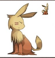
Wynaut

Wynaut, is the baby form of Wobuffet, which was already an odd duck to begin with. Like all babyforms they’ve upped the cuteness considerably giving Wynaut “kawaii” manga style eyes and a big happy smile. However they’ve also chosen to increase Wobuffet’s multiple head shtick going from two heads to three. Those would be the obvious head with a mouth and eyes and the second head in the tail like Wobuffet has but also a third that kind of looks like a knob on top of the first head. Look at the shape, Wynaut’s first head is the body with the third head on top, two arms/ears and two legs then it’s second head in its tail. I like that idea, they haven’t done something like that since Tentacool but its something that happens in nature all the time and makes for a strong design. I also like Wynaut’s ridiculous pointless squared off arms better when they’re actually ears since ears can be flappy and end in squared off edges wheres arms really shouldn’t.
Snorunt and Glalie


I’ll get it out of the way quickly. I hate Glalie just because I hate on principle those Pokemon that are just a head. A head and arms fine, head and legs fine, some kind of inanimate object posessed by electricity or a ghost fine but Glalie is just a floating hockey mask and nothing more. How does it move? How does it eat, excrete, mate, etc? I don’t exactly want realism but I want something that looks like it could at least move around and not just a, well, a head!
Snorunt is okay though being basically another version of the Namahage monster I showed earlier this time playing up the traditional dress and houses of people living on Hokkaido, the Northern island in Japan.
Spheal, Sealeo and Walrein


Spheal has my vote for cutest pokemon design ever. It’s a ball, a ball of blubber with a face. Imagine the cuddles! It is pure cuddliness personnified!
Also localisation team, well done! Spheal is a pun of which you should be very, very proud.
Sealio and Walrein look more like real world seals and walruses done in a competent cartoony style and that’s all I have to about them.
But Spheal, soooooo cuddly!
Clamperl, Huntail and Gorebyss


Is, is that pokemon wearing a bra?
Its a fish, why the hell is it wearing a bra? Is it a little mermaid reference? Is Gorebyss supposed to be a mermaid? Does it have nipples?
The fish bra, it raises so many questions.
Relicanth

Relicanth is a very dull design based on a very cool fish. It’s basically just a cartoony drawing of a Ceolocanth. Ceolocanth’s have a very interesting history to them, particularly their discovery since for most of human history they were believed to be extinct and were only know for fossils. Then they were rediscovered, almost by accident, alive and well in Indonesia in the 1930’s.
Their discovery caused a huge uproar in scientific circles because the Coelocanth is believed to be the oldest common ancestor between fish and amphibians (although it is alleged that this may be lungfish) and possibly relatives of the first fish to ever walk on land. This is speculated due to the shape of the Coelocanth’s fins which are fleshy and share certain similarities with feet.
There are lot of ideas you could emphasise with a Coelocanth design, the living fossil aspect, the fish that walks aspect, etc but Gamefreak have chosen to just present it as is, evidently feeling that the actual fish is interesting enough that it doesn’t need a further gimmick.
Luvdisc

Luvdisc has to be the most simple Pokemon design, especially in this Generation. Literally a heart shape with eyes and a mouth. Yet it does actually look like this could be a fish with the overall body shape being very fishy. That’s quite a feat to pull off and Luvdisc is a nice design, clever in concept and clean and simple in execution.
Bagon, Shellgon and Salamence


Bagon just looks like a cludge together of some of the worst possible design ideas Gamefreak have evEr had. His ears look bizarre, he has stupid stubby little arms, hooves and some kind of armoured head/hair that looks like a mullet.
and Salamence is just another attempt at doing a western style dragon, only with very badly drawn wings and pointless gen 3 complexity like the plates on his belly, the weird colouring on his neck and his 6 pointed head.
The real joy in this trio though is Shellgon. Now obviously what they’re going for is a cocoon idea and they’ve done that sucessfully many times before. What makes Shellgon different is his angry eyes and tiny little legs. The mental image of a cocoon running around head butting things is just too cute and too hilarious. I love this little guy, he’s like the Scrappy Doo of Pokemon designs.
Shellgon also starts a trend of “why the hell is this a dragon type?” questions. For reference the cocoon that walks like a man above is considered a dragon but all the following are not.
")

oh Pokemon logic, long may you continue to never make sense.
Beldum, Metang and Metagross


I’m not a fan of Beldum at all because I can’t see how that works as an organism at all. It has no mouth, no limbs, no overall shape to it. It’s a foot with an eye stuck on the end and that’s just stupid.
Obviously the idea is that this is a monster inspired by model kits. Beldum is a foot with a ball joint and you combine it with other parts to get a Metang and finally a Metagross. I kind of like that idea but as an individual Pokemon it just doesn’t work.
Metang looks better since it has a face and limbs but is still a rather dull design.
Metagross though is pure badassery personnified. Look at that thing, look at all the personality and expression it has on a face that consists of just eyes and a big X. He looks angry and worse he looks like he’s coming to get you, and when a giant steel spider is coming after you, you better be scared! The shape of the legs, the pose and the low slung head just all convey power and danger. It’s a great design.
The Three Elemental Golems Regirock, Regice and Registeel


Here we have the three golem pokemon. Golems in Hebraic mythology are men made of clay and animated by holy words who do the bidding of their creator. Golems in Pokemon mythology are elemental tools made by the creator of the land to help him out with constructing it, so Regirock sculpted the rocks, Regice sculpted the glaciers and Registeel sculpted the iron desposits.
That’s a fairly cool idea for some legendary Pokemon and I get where they’re going with the design, these are supposed to be effectively robots, lifeless tools created to do a job, and in a sense the original golems were just magic robots as well. Consequently they don’t really have faces they’re just vaguely humanoid elemental shapes.
But I don’t like the execution at all, they just look boring and the series of dots for a face is just off putting and weird. Regirock is okay since he does look like a rock monster and his design conveys movement and power. Registeel is just dull but Regice is terribad. The other two look like robots, he looks like a bunch of icicles stuck together. He also looks like he’s about to perpetually fall over from his tiny, tiny little spiky feet.
Latias and Latios


Latios and Latias are jets. But unlike most attempts at turning inanimate objects into Pokemon they haven’t just slapped eyes and a face onto an object but rather tried to design a living organism so that it resembles a jet in flight. I mean look at Latias, you can see a head, a neck, arms a body and a tail. That’s a living creature even if it lacks legs. But look at Latios there, the long neck, the swept back V of the wings, the slightly crooked nose at the front. It looks like a stylised Concorde jet in flight.
It’s a neat conceit for a monster and well executed. These two have a really streamlined design and a real sense of speed and motion,
Kyogre

In previous versions of Pokemon all the Legendary Pokemon (i.e. those particularly powerful and rare Pokemon that never breed and that you can only catch one of in each game) were available in every copy. So in Gold and Silver you can catch both Lugia and Ho-Oh. Starting with Ruby and Sapphire that changed so Kyogre is only available in Sapphire and Groudon only available in Ruby. It was a cynical attempt to shift more copies of games since most people are reluctant to trade their legendaries and so players who wanted a complete pokedex would have to actually buy both copies of the game for themselves.
But despite the bad taste in my mouth Kyogre reminds me of how is his actual design?
It’s a Killer Whale with giant hands/fins. And they really do look a lot like hands since they have fingers and most fish (captain birdseye aside) are not in posession of fingers. Of course whales aren’t fish but you get what I mean.
I mean its fine for what it is but it isn’t very inspiring. I think the main problem for me is that with other legendaries you can see their face. Mewtwo, Lugia, Groudon they all have facial expressions and those expressions convey personality. Moreso than regular Pokemon its important for the legendaries to have a sense of personality and motivation and not just look like animals. Kyogre is the lord of all the seas, we should gaze upon his visage and fear it. Instead we get a whale with really big hands.
Groudon

Groudon absolutely shouldn’t work. It’s a dinosaur with tons of added crap basically. It has weird mutton chops, spikes and lines all over it, a rake for a tail and an egg slicer for a head. It should look stupid but somehow the whole comes together. The short, stubby but thick legs and hands convey power. The hunched over posture makes it look angry, like its about to charge off at you and all the angular lines and spikes really sell this as a monster of rock and the earth without it actually having any earth textures per se. I like Groudon a lot, he looks like a typical Japanese Kaiju, like Godzilla or something similar all ready to rock up on land and start destroying Tokyo. Yet he is distinctly his own beast and bears no actual resemblance to any popular kaiju specifically, its more that he has the essence of that kind of design about him.
Rayquaza

Surprisingly we’ve had a lot of Western style dragons (Dragonite, Charizard, Salamence) but not many Asian style dragons. Gyarados is one example and you could argue for Dragonair and Dratini but Rayquaza is undoubtedly an Asian dragon, a long snake like monster with fins, wings, terrible claws and a large horned head.
Although obviously they’ve styled his design to make him a trio with Kyogre, lord of the water, Groudon, lord of the earth and Rayquaza, lord of the sky. The squared off horns and fins echo Groudon’s squared design and the thick black lines on his body are a repeated element across all three designs.
For some reason Rayquaza is actually one of the most popular Pokemon designs but its not an opinion I share. Its a perfectly good design but it doesn’t have an awesome gimmick like Shedinja or a strong hook like Bulbasaur It’s not that badass or that streamlined and it certainly isn’t cute. If I had to hazard a guess I’d just say that a lot of people think Asian dragons are cool and that’s the reason for his appeal.
Jirachi

Jirachi is yet another pokemon whose inspiration isn’t immediately obvious and requires me to go off on a long explanation about some aspect of Japanese culture.
Obviously Jirachi is a star, but more than that it’s a reference to Tanabata, the star festival.
Tanabata is a festival held in various Asian countries but principally in Japan during July over a period of a few days. It celebrates the meeting of the two deities Orihime and Hikoboshi which can be seen in the sky as the stars Vega and Altair.
The myth of Orihime and Hikoboshi is thus (stolen from wikipedia)
“Orihime (織姫 Weaving Princess?), daughter of the Tentei (天帝 Sky King, or the universe itself?), wove beautiful clothes by the bank of the Amanogawa (天の川 Milky Way, lit. “heavenly river”?). Her father loved the cloth that she wove and so she worked very hard every day to weave it. However, Orihime was sad that because of her hard work she could never meet and fall in love with anyone. Concerned about his daughter, Tentei arranged for her to meet Hikoboshi (彦星 Cow Herder Star?) (also referred to as Kengyuu (牽牛?)) who lived and worked on the other side of the Amanogawa. When the two met, they fell instantly in love with each other and married shortly thereafter. However, once married, Orihime no longer would weave cloth for Tentei and Hikoboshi allowed his cows to stray all over Heaven. In anger, Tentei separated the two lovers across the Amanogawa and forbade them to meet. Orihime became despondent at the loss of her husband and asked her father to let them meet again. Tentei was moved by his daughter’s tears and allowed the two to meet on the 7th day of the 7th month if she worked hard and finished her weaving. The first time they tried to meet, however, they found that they could not cross the river because there was no bridge. Orihime cried so much that a flock of magpies came and promised to make a bridge with their wings so that she could cross the river. It is said that if it rains on Tanabata, the magpies cannot come and the two lovers must wait until another year to meet”
So what does any of that have to do with Jirachi? Well Jirachi is more to do with the festival itself than the story. One of the ways Tanabata is celebrated is by writing notes containing wishes, usually in the form of a poem and then attaching them to a wish tree. The wish tree is decorated with these colourful strips of paper and usually other decorations as well and then on the last day of the festival paraded around and then disposed of either by setting it in a river or burning the tree. Different areas in Japan have their own customs but the sight of a wish tree is a strong image of Summer and of Romance in Japan.
Here’s a wishing tree all decorated for you.

See the rectangular strips, those are the same strips Jirachi has hanging from the points on his head.
I like Jirachi a lot actually. Its obviously fulfilling the same role as Mew and Celebi from previous generations i.e. the small “cute” legendary but I think it surpasses both of those. For starters in my own humble opinion its a cuter design and secondly I just find it to have a stronger and more evocative hook.
Deoxys


This generation also introduced the idea of pokemon with multiple forms who could shift appearance and shape and Deoxys is kind of the poster child for that design concept which would crop up more commonly in later games. Unfortunately for me that means I have 4 designs to critique instead of just one.
Why does he shape shift into other forms? Well to know that you’d have to read his fantastically bizarre pokedex entry.
“The DNA of a space virus underwent a sudden mutation upon exposure to a laser beam and resulted in DEOXYS. The crystalline organ on this POKéMON’s chest appears to be its brain.”
This just raises all manner of questions.
Firstly the idea that lasers cause viruses to evolve is so lolwut that we’ll just skip over it. It’s so stupid it doesn’t really warrant further discussion.
But scaling back from that what on earth (well, I guess not on Earth at all actually) is a space virus? A virus by definition exists by replicating in the cells of other living organisms. It can exist outside of a living cell for some time (hence why you get airborne viruses) but in space? Space is big and empty guys and not exactly full of life, what was this virus doing in space in the first place?
It also raises the issue of just what the hell a Pokemon is in the first place. That’s more of a loaded question than you might think.
Obviously a Pokemon is a monster you can catch in a Pokeball and which responds to human commands but beyond that the definition is weird on a number of levels. Nintendo used to say that the defining characteristic of a Pokemon is that all of them share the same DNA despite differing in appearance, thus why they can breed with each other freely. Now Nintendo have moved away from this explanation in recent years presumably because it is so stupid that I could write a 1,000 words purely on just how stupid it is easily. But it begs the question if this virus didn’t have Pokemon DNA, because its a virus, how did it sudden;y get Pokemon DNA? And anyway most viruses have RNA instead of DNA, although obviously Deoxys is the DNA kind since it is named for deoxyribonucleic acid.
Or alternatively are all animals in this world pokemon or are there non pokemon animals? The anime seems to suggest there are non-pokemon animals since the main characters are often shown eating chicken, beef, etc and real world fish are shown swimming around in fish tanks and the like. I’m fine with that and that allows for us to have viruses that aren’t Pokemon, but then this virus became a Pokemon! Can the real animals turn into Pokemon? You might scoff at this but remember in the Pokemon universe evolution happens to individuals not the species so can a cow evolve into a Miltank? What if you fire a laser at it?
I don’t think the designers ever intended to do this but Deoxys just cracks open the whole can of worms on what exactly a Pokemon is and they never really managed to explain it since.
Anyway messed up backstory aside (seriously, a laser!?!) Deoxys is a pretty decent design. Obviously his key design elements are alien, virus and DNA and he’s all themed around mutation and change. He hits all of these elements and the end result is pleasingly coherent. Firstly you’d see him as an alien, the shape of the eyes, the just overall strangeness, etc look very alien and specifically they look like the kind of rubber suited monsters Ultraman would face. Hell, he even looks a little bit like Ultraman. The DNA and mutation stuff is pretty clear too, his arms are double helixes which took me forever to notice but once you do is a really nice idea and obviously he shape shifts because he is mutating, just like a virus.
The overall body shape is odd not looking like any real animal or even that humanoid but actually it does look a lot like electron microscope images of viruses. I’m no virologist so I couldn’t name which one but I have definitely seems virus with similarly pointed regular “heads” and stubby sticking out “legs”.
The forms vary for me. I like the speed and defense forms since they sell the idea of what that form is adapting to do. The speed form is thinner with longer legs and only has 2 arms instead of four. It looks more lightweight and streamlined, hence speedy. The defense form is bigger and bulkier and I particularly like how the head is sunk into the shoulders, it sells defense visually straight away. The attack form however doesn’t sell it, being basically the normal form with a more swept back head and pointy knees. I don’t think I have ever been intimidated by a knee no matter how pointy.
Overall I think Generation 3 may actually have the strongest designs of any game. They’ve moved away from taking an existing animal and sticking a spike on it and have started to bring in more complex and unusual inspirations. Viruses, Dogu, Yokai, the weather, Japanese Festivals. The designs exhibit more variety and really work to sell their underlying gimmicks. There are less boring anthro monsters and less real animals drawn in a cartoony style. It’s a great generation.
On the downside the designs do start to get very complicated and full of unnecessary clutter. They also lose some of the simple iconic power of the original designs. We’re also seeing a creep in Legendary monsters going from 5 in Gen 1 to 6 in Gen 2 to 10 here.
Unfortunately Gen 4 would take the worst lessons from Gen 3 with more complexity and more legendaries but less original ideas and a real sense of doing riffs on older designs.


")


")


")


")


")


")


